Wednesday, June 25, 2014

Bon Voyage........

I Learned a new word; 

VALISE
[vuh-lees or, esp. British, -leez
noun
a small piece of luggage that can be carried by hand, 
used to hold clothing, toilet articles, etc; suitcase; traveling bag.
Origin:
1605-1615;  < French  < Italian valigia, of obscure origin; 
compare Medieval Latin valesium 

Regrettably, I had lost touch with my beautiful niece, not having seen her in probably what's been going on at least ten years now.  Divorce will do that; it tears relationships apart that once seemed so solidified .....so permanent.
 Ah, the comfort one feels when taking things for granted.....
then POOF.....everything changes.
  
Well, imagine my delight when I looked her up on the ol' internet and actually found her!  A miraculous feat worthy of noting for this technologically challenged gal!  Not only did I find her but, I was so impressed with her accomplishments; clearly she had grown into a very clever and gifted young woman, quite articulate in her writing skills, (and she possesses a creative gene or two - to boot)!  I discovered she has an interest in vintage clothing and is modeling her own finds and blogs about this...... what I found were the most interesting posts to go with her beautiful photography.

  I am honored to be allowed the opportunity to paint 
this young lady. 

So, what follows is what I hope to be one of many pieces featuring 
her and her smart sense of style portraying an era of fashion I have always admired.  Is it possible to live 
vicariously through paintings I wonder?

#1
#1)  Starting with her face - while I would love to capture an exact likeness, I was going more for her essence and when doing paintings with people as the main subject - if you don't have that essence just right in the face....well, you ain't gonna get nuthin' else right......so with the goal of creating a sense that she was possibly watching her ride appear just around the block, or perhaps a boat.....or a train?   I proceeded to brush her in using the following colors;

cadmium red dark
manganese blue hue
burnt sienna
burnt umber 
titan buff
titanium white
ultramarine blue

Her hair is rendered using mixes of the same while her jacket I added hooker's green (how the heck did they ever come up with THAT name for green?)   Glad you asked!  I looked it up and get your mind outta the gutter folks, no it wasn't the color of some famous hooker's dress.....it's named after William Jackson Hooker.  He was a renowned English botanist, author, and botanical illustrator who compounded his own special pigment for the leaves in his paintings and dubbed it..... hooker's green!  For the valise I added in mixes of predominantly transparent red iron oxide with manganese, ultramarine, and  titanium white.  

Knowing that I would be doing a lot of glazing (layering of paint) I blocked in the rest of her clothing and the bag with very washed out colors of what each finished area would have - sort of like drawing a map.


#2
#2)  Once I was content that she looked more human than alien, I moved on to the secondary focal point(s); her hands and that mysterious bag.  From the get-go, my intention is to have a finished piece with tightly rendered focal points and loosely done around the rest of it.  Sort of like when your eye looks at something but, while we aren't usually conscience of it, the areas around what we are focusing on are diffuse.


#3

#3)  I had planned to work up the background while I built up her clothing but found myself sidetracked - on folds of fabric maybe? And plans are just the universe's cue to  intervene and change things up - right?  Keeps things spicey for us, doesn't it? Anywhooo........next time I will try and stick to the plan, it would have been easier that way.


#4

#4)  Things had progressed to the point where it was time to stop, so after a restless night, I was back at it early the next morning  softening the background - favorite color of the day; titan buff - used to feather in/ blend with surrounding colors.  So, this piece is rolling along at a pretty good clip.....they don't always.......I find it amusing when someone asks: 

"How long did it take you to paint that?" 

Unless you are an artist, I have found people really are clueless as to the time (and mental energy) an artist has to invest in a piece.  This one has over a dozen hours of actual brush to surface time into it but, what also needs to be accounted for is the hours of "think" time in the  planning phase, the studie(s) an artist may do prior to painting (or may not do), the surface prep time - ie; gesso, and another coat, and another....one more maybe?......even the time spent on sealing the darn thing (adding a coat of protection) and mounting the hanging hardware in the end, add to this additional time (and $$$ if you are actually framing it)........ not to mention the restless nights where in the wee hours at 3 a.m. when you have an epiphany regarding the current piece you are working on that makes (or breaks) the whole piece during the next days painting session.  All totaled, well as you can deduce......I am not really sure of just how many hours this took.  Suffice it to say; A LOT.....how's that?    

In conclusion; A few finishing touches - cleaned up a few shadows and there you have it.....(or so I thought).  It's Murphy's Law at work here; when I finally added my signature (which is supposed to be the last stroke of paint) inevitably this is when I receive that "ah-ha moment" from my elusive muse.....it's only then that I see a spot that needs tinkering. Why is this?

So......spot fixed......here it is:

#5

Bon Voyage 
12" x 24"
 acrylic on deep cradled panel board

*********

Wednesday, June 11, 2014

50 shades of Maisy Grace.....


One of my two favorite Scotties, my sister has a pair of these lovable little terriers - oh wait - my brother's name is Scotty, so I guess it's actually one of three.........

With the exception of a pinprick size blob of quinacridone gold and sap green, this piece was painted exclusively using the following four colors - and that's it!  


Burnt Sienna, French Ultramarine Blue, Manganese, and 
Rose Madder Genuine..........here after referred to as; BS, FUB, M, RMG.


(1)
 #1. Map out the darkest darks, using various mixes of BS and FUB...... have intentions of laying down full values here (fail miserably).  It's OK though, as I am now, always have been, and looks like I probably always will be a glazer (doing things in layers).  Later I will be going over these areas many more times, no worries. 

Hey, instead of being a trail blazer.....I am a trail glazer !  :)
  

Note; I have saved out the bulk of my white high-lights 
with masking fluid (to be removed later).


For the one eye visible I started with a wash of straight quinacrodone gold, then after completely dry; glazed it with BS.

The ear got a light wash of RMG as did her collar.


(2)

#2. Now I washed over her secondary dark areas with a lighter version of BS and FUB and dropped some M and sap green onto her tag.  The eye receives a pupil using BS and FUB (full strength), having saved out the high-light with masking fluid is a real time save for small spots like this. And a light wash of M and some BS to start building the ear color.
People often ask me;  "How do I see colors in a photo when they can't?"  I think it's that I see things no different than anyone else, it's just that I exaggerate what suggestion of colors I do see.  The reference photo of this lovely canine had many subtle "shades" of black that I drew inspiration from.

(3)
#3. Sloshing on some background color as I work around the piece letting it bleed out from the edges of her fur......am working round and round over the entire piece adding various mixtures of BS, RMG, M, and FUB. Where I want to create the illusion of receding I use cool colors and 
where I want it to look as though things are advancing I use warm colors. 

(4)
#4. By now I have removed the dried masking by simply rubbing it off (Love this stuff!  Don't use it often but when I do it's a great time saver allowing me to wash over areas that would be saved as the white of the paper without having to worry that I have "lost" the white).  I continue to refine by adding depth and value but leave a lot of areas ambiguous in this loose rendition so the viewer can use their imagination.....the ol'  less is more  trick. The beauty of working on hot pressed paper is the ability to quite simply rub out color in areas I want softened. A little dab of H2o and blot with brush or paper towel and there you have it; a nice soft blur!

(5)
"50 Shades of Maisy Grace"
#5. Notice how on this final view, this adorable Scottie still "reads" as having a black coat....... 
yet she's filled with color! 

*********

Thursday, June 5, 2014

A most "Value"-able tool...........


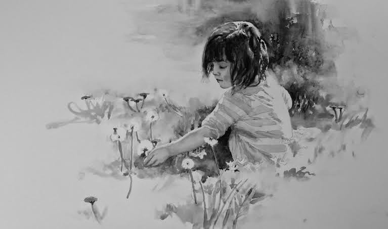
"Dandy Wishes" 
watercolor on hot-pressed paper

People of my generation (think dinosaur) aren't quite as technologically savvy as the kids of today who have been raised on all these new gadgets with every bell and whistle that one even 10 years ago could not possibly imagine.  So, for this self proclaimed technologically challenged gal anyway, it is of great delight when I finally stumble onto a particular feature on a new gadget and figure out how to: 

A) discover it in the first place 
B) learn how to actually use it 
C) remember how to use it the next time


Inevitably, when I hit a road block on one of my paintings...... it is consistently in the value department.  I spend a lot of time pre-painting in my head ..... thinking it through before I ever begin to put down the paint - mostly it's about my composition though. (Especially if it is on a panel or canvas where they can't be cropped like you can so easily do with a sheet of watercolor paper). So if at some point it just doesn't seem to be working, I check my values and waalaa! I have found the error of my ways and can then easily move forward in the right direction. 

***************
Exactly what is this thing VALUE that I speak of ?
 Value, (in art and we're not talking monetarily cuz let's face it, there isn't much money to be had in art anyway, now is there?).....in a nutshell; a gradation of tone from light to dark or of color luminosity.  The relation of one of these elements to another or the whole picture.

***************

One of the features I utilize on a regular basis is located on the camera of my smart phone. You can also utilize the editing features of Instagram and Pixlr-o-matic apps to accomplish the same thing.


It use to be back in the pre-cretaceous period, we would hold a sheet  of red plastic film over our work to see the "values".....now this can be done as simply as snapping a picture and quickly going to the edit feature.


Easier still, you could squint down your eyes so much so, that all you see are the values, but that seems to be a difficult thing for some people to do. So for those who fall into this category, use the techno method.  It's easy-peasy and I am sure you will come to love it!

Below are some visual steps I took for the watercolor "Dandy Wishes" followed by a black and white version of each so you can get a feel for how looking at your work in terms of value can affect your next move.

#1


#2


#3


(My favorite one out of all of them - even over the color version!)


#4


.....and finally #5, the finished version:


The down side to doing this is the occasional discovery that you prefer it in black and white .....hey - it happens sometimes!