Saturday, November 1, 2014

THE FITTING.....

I had been more than a little busy lately.....what with creating a wedding dress and all of the other responsibilities that went along with being the mother of the bride, and opting to hold the ceremony and reception at our home.

It didn't matter if she wanted a gown as elaborate as my own first wedding dress (thank you Princess Diana for the poofy overdone fashion influence), or if she preferred a more fitted, low cut fishtail silhouette like the one I wore for my second marriage (the one where I finally married Mr. Right). Both of which, I designed and made myself.

It also didn't matter if she wanted one of any of the many other gown styles I have created over the years.  I didn't care if all she wanted to wear was a pair of old blue jeans and a T-shirt, whatever she decided; I wanted to be the one to make it.  Having waited almost 30 years for this event, I can honestly say I had a blast finally creating my daughter's wedding dress.

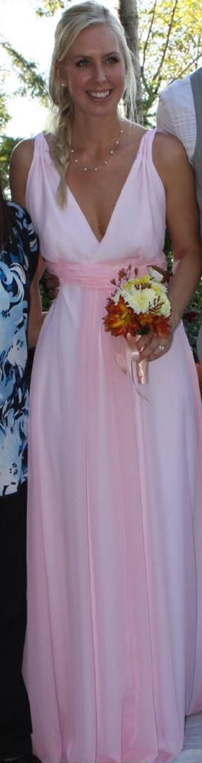
I guess it both surprised me and yet it didn't, that she chose to go nontraditional and have a pink gown.....she always has been such a rebel.  So, that she did; her selection was a soft shade of pink in a sheer with a lovely flowing quality to it, which overlays a pure as the driven snow white satin.


So, it came time for the
 first fitting and I hadn't 
sewn together the sheer 
overlay yet. Pieces scattered
 about the room as we 
measured, tucked here, 
gathered there and she, 
clearly dreaming the dreams 
a bride does at this stage. 
It won't be long before she
 will be moving halfway 
across the country, in fact 
they are due there shortly 
after the nuptials.  
A scenario that will most 
likely take place quite 
frequently over the course 
of their marriage - 
moving a lot that is,  having 
fallen for a military man 
(and quite a wonderful one at that!).


While I had her over for this particular visit, thinking ahead I had asked her if we could do a photo shoot as well (an obligation one has when one is an artist's offspring; modeling).

Afterwards, I took my seamstress hat off, then I donned my artist hat and we headed straight to my studio and I began setting up.  Pieces of fabric flung here and there still remained from when I had the gown laid out for cutting on my roomy floor.....
 idea's began to flow of what poses I would have her try, where to place the lights....etc., etc.

Around about the umpteenth shot, as articles of clothing began disappearing, I thought "wouldn't it be nice if we had some drapey sort of sheet or something to add to this....something that provided lots of complex folds and shadows?"  Then it hit me.  "Duh!  Let's really get a real run for our yardage dollars and drape some gown pieces over her strategic parts."

So drape we did and what resulted were pretty impressive shots for this amateur photographer - if I do say so myself....... and I couldn't wait to start painting from them!


#1


#1  After sketching on a large piece 
of paper the general idea, making 
sure proportions are correct, I then 
cut that out and placing it on an 
already painted panel, I trace 
around it with chalk to use as a guide.  
I am now ready to begin the 
actual painting of our bride.


#2

#2  Laying down a base coat 
or under painting I began filling in the skin areas
 with mixes of titan buff, alizarin crimson
 and burnt sienna, again watching 
my proportions. 
 (I saw already that I needed to tweak that left arm).


Just played with the blends a little on my palette to get that "perfect soft pink" that's in the fabric!


#3

#3  I was going to be applying many layers of various colors for her hair so I began to lay in some of the highlights creating a road map of sorts for myself.   The fabric also would have many layers and nuances throughout the many folds so I started with a soft pink achieved by mixing titan buff and alizarin crimson. I started some high lights on her skin here also.


#4

#4  Just back from a Caribbean cruise, she was about as sun tanned as one can get, so burnt sienna was my go-to for that sun goddess look.  Here is how I do a lot of my mixing....right on the painting!  I just load a couple different colors on my brush (looks like titan buff and b.sienna here) and I am careful not to blend too much, as I want to see brush strokes and variance in color in my work.


It always amazes me what can come out of the mess I make on my
palette (and surrounding area).....and no, I don't use a real palette.  Nothing fancy here; a styro-foam plate works just fine for me and I can toss it when I am done!  My drafting table is where I do most of my work using a table-top easel and I have learned it's best to keep it covered with protective paper, for obvious reasons!


#6
#6 Building up of the skin and more strands of hair emerging.


#5  The way the light hit, or lack 
#5
thereof, on her hands
left me with a challenge;  
paint what you see, 
not what you think you see.
I struggle with this, always
overly confident I know
what actually lies in the 
shadow and constantly 
failing miserably when I so
vainly try to render what 
don't see.  So, with immense
self discipline I proceeded 
and painted only what I saw 
and am pleased with the 
ambiguity that resulted. Having left them well shadowed 
- me thinks - also helps show off the ring which is of course 
an important part of the story within this piece.


I just love, love, love the creative patterns that appear magically on my palette as the colors sneak past their borders and visit with the neighboring ones!  (I always dream of doing a large wall size abstract when I see this)


#7

#7 Continuing to add layers of hair in variety of shades, some color and shadows worked on.


Mangenese blue is working well 
in the shadow areas for both her hands and the fabric


.
#8
#8 More layering of her hair and dabs of paint in all sorts of places to what would be for anyone else ad nauseam but, I delight in picking my work apart even if it's the most minutely off.....I gotta fix it (bless my ever lovin' OCD heart!).  I am kidding.....if I could just learn to let these little things go.....I could produce a lot faster - I am sure!!!


#9
#9 Same thing but taking a final look at it 
in b/w to check my values....


One of the most interesting things I find about painting a piece with    a humanoid portrayed, and whence that human views said piece,                      is how they react to my interpretation of them.
I will never forget a commissioned piece I did years ago as an anniversary gift for the woman's husband.  It was of the middle aged couple and the woman's first words were; "Gee, I didn't realize I was so fat!"  (I guarantee it was not because of my rendering of her with any extra brush strokes.....truly it was quite an accurate portrayal of her).  She had never said "paint me thinner" prior to my starting the piece so she got what she got.....was I supposed to read her mind and instinctively trim the fat, so to speak!?  Enough of my ranting......she did end up buying the piece after all, and I was told it made her husband cry 
(in a good way folks).


Back to the current story.  When I unveiled the finished piece in front of my daughter and her fiance' he either was genuinely impressed with it (or is a really good actor), and she too, seemed thrilled - yay for me!   Upon further study of the piece she then says;  "Hey my boob's aren't that big! And my rear end's not that round......but I like it!"


Hmmmmm.......

Now here is where artistic interpretation and self image/esteem cross paths.  I know being her mother that I am probably not the most impartial or objective judge of my daughter - don't all mothers think their daughter is the fairest, most beautiful creature of them all? Well, I know for a fact mine is.......you can see it on any member of the opposite sex's face who is blessed with her presence - she is one hot mama!   So, being a stickler for accuracy,  I meticulously attempted to render her just as she is. She just looks at herself with a much more critical eye, sadly a trait that so many woman in today's society possess (thank you media for airbrushing our expectations to the point of all things unattainable). I am afraid I may have more than a little to do with the image she has of herself, and have passed on, I am sure a little of that nasty gene (having harbored more than a little self doubt about my own appearances much of my life).  However, now that I am older and wiser, I honestly don't give a crap what anybody thinks and that attitude has helped me feel much better about myself, something I hope she learns to do much, much earlier in her life than I did in mine.

.....and finally:


The Fitting
acrylic on deep cradled panel


Thanks for visiting!

********

Friday, July 25, 2014

Knot Nude...........


"Just sit there with your hands folded and wait patiently". 

 I have been told this on more than one occasion in my life 
(by my mother).  
So, as you will see here this is exactly what I did. 


Procrastination 
Some call it being lazy or unmindful planning.
I have another name for it.  

Knowing when the time is right.  

Fifteen years in the making this one is, and let me explain why:


I did a photo session with an adorable little gal that I had discovered  in my hairdresser's shop working the reception counter.  As per usual there were several rolls of film that I shot (yes, I did say rolls.....remember them?).   
Turned out, very few images were  particularly inspiring - 
owing to my lack of photography skills I am sure. But, I have painted many pieces with her in them since, and always enjoy bringing up the subtle colors I see in her beautiful skin.


Among my favorites was the photo that inspired this piece Knot Nude.  I could never settle however, on what kind of background I wanted to place her into.  My painting style at the time though adequately skilled, had not quite matured (or morphed) into what I was envisioning in my mind.  Always on a quest to "loosen" up my style, I never seemed to get the message from my mind's eye down to my brush when I painted.....until recently.


I decided to take a more direct approach with the background, using a palette knife I very directly globbed it on and rubbed it around very much like when I frost a cake - how fun!  Then the exciting part began - skin.  
I now love the challenges that come with this, 
(something I did not enjoy much 
way back when I first began painting).

If I may be allowed to be a bit corny here; I didn't want to paint this piece until I knew I was going to be putting my best foot forward (pun intended).  


Not until this last year have I finally started to see the lost edges and ambiguity coming forth in my work that I had always knew I could produce.  It is funny how styles emerge.  When first beginning to paint, I started out rendering very tight realism.  The longer I plug away at it, the braver I get with loosening things up......now that I am getting there, I wonder why I was so cautious about it and didn't start doing this earlier....it's very freeing and fun to not be so careful!


Countless times my reference photo must have gotten pulled from my box of pictures since I took it, never wanting to tackle this piece until I had achieved the style I somehow knew was brewing within;  I think it must be like that old advertisement:
  (if you are from the west coast you may remember)

it was the one put out by Robert Mondavi back in the 1980's or 90's whose slogan was:   


"We shall sell no wine before it's time".  


Well here is my slogan:


"I shall paint no painting until I am darn good and ready!"


During a recent dinner gathering at our home, I was giving my mandatory studio tour to the fam-damily and my dear Mother commented that she found this piece offensive (for lack of a better word she said).  She did not care for the position of the model as it suggested her nudity and Mom being the conservative type would rather have the girl in a more lady-like pose.  (She never holds anything back when critiquing my work - love that about Mom!)  But, I told her that this then, was for me proof that the piece is a success....it made the viewer "think" about it a bit rather than just move on to the next piece! 


I had always intended to call the piece Not Nude, from the time I took the photo......and it was suggested after my mother's reaction by my wonderfully witty husband that I consider calling it

Knot Nude

 instead.....emphasizing the peculiarity of the model's pose.


Knot Nude

18" x 24"
Acrylic on cradle board

My model was actually donning a skimpy tank top and short shorts in the photo, but strategically positioned as you can see, it leaves one wondering - I hope anyway - as that was my intention.


I am sure in the future my style will evolve even further 
and years from now I will look back on this piece 
and think of it much in the same way as I do of the earlier work  that I look back on today......
"my how my style has changed"
(and hopefully be pleased with the direction it took)!

********


Monday, July 7, 2014

Captive Angst........

I am fortunate to live in an area of the country where eagles abound, both the bald and the golden eagles. From my home perched high upon a ridge overlooking the canal, daily I witness their amazing grace.  I've watched them lock talons and plummet towards the earth in what would appear a suicidal wish, only to part and return to a safer altitude seconds before a fatality occurs. It's true in the animal kingdom too - what you won't do you will do for love - it's all a part of the mating ritual for them.....eek!


Even with a wingspan of up to 7.5 feet,

it's almost comical the way they can

be intimidated by the very territorial

pair of crows which guard our ridge here.

The crows are relentless in pestering these

majestic birds to the point of (I am certain) 

ad nauseam.


In a previous blog* I had referred to a Birds of Prey sanctuary which had me taking tons of photographs and walking away very inspired.  And depressed.  While it was a wonderful place for these birds to recover (and/or live out their days if necessary due to injury), the empathy I felt for these great creatures was immense.
*see previous blog entitled; Housekeeping as Inspiration  under the month of MAY- cuz I am just sure you were wondering so you can zoom over there just as soon as you finish this blog....go ahead - I know you want to, the blog list is just to the right .

Later, in conversation with my nephew,  he shared a photo he had shot of this golden eagle at a rehab center near him.  I just knew when I saw the photo I would HAVE to paint this one!  This great creature's look/stance just screamed to me the frustration and boredom that he must have been feeling towards all things "humanoid", as though he was completely aware of the fact that if not for the stupidity of some human activity he wouldn't have been required to be here!  Most of the paintings I have seen of these magnificent birds are done in a more regal pose, and I was immediately drawn to the peculiarity of this one.

 I did change the background from what was in the photo......he was originally up against a chain linked fence at a different angle and perched on a well worn beam.  I chose a rock for a more natural perch and moved the fence for a more balanced composition .....hey - artistic license, what can I say? 

 Did I succeed I wonder?

Though this is a very monochromatic piece, I am always surprised when  I use a limited palette.   So many colors actually appear in the finished painting.  For this piece I only used variations of four colors......


and a little dab of yellow just for his eyes.

 I truly hadn't a clue about how I was planning on building up the area on the back side of the fence so I blindly proceeded (how professional).   Using different brushes, a sponge, and eventually a palette knife which I used to scrape down and move pigment.  This experimentation netted a look I was pleased with.  I then set out to render the posts and the chain link......all the while reminding myself to stop short of finishing it all the way - "we wanted just a suggestion of a fence, leaving something for the viewer to imagine"
 I'm glad I stopped where I did, happy with this innuendo of a fence.  Now on to our bird with the attitude.....

Did you know; the golden eagle is 
North America's largest bird of prey? 

#1
 #1)  Beginning with his head, I exaggerated the blue on his beak (just because I liked it) and then proceeded with the eye. The eye is the one place that can either make or break your piece.


#2


#3


#4


#2) #3) and #4)  
What began as an attempt to loosen up my style, quickly became a challenge to accurately mix the colors for each feather of our star of the show, 

(and in doing so, clearly lost sight of my goal to loosen it up).  

For the most part I was able to match colors to the photo and discovered after the paint dried that the accuracy was improved  further by going back over many of them with a glaze or two of a slightly altered shade of the same hue.  I found myself almost hypnotized with the feathers as I painted them. 
( I know....weird )

********
Interesting fact: the golden eagle has over 2,000 feathers, from small downy ones for keeping the bird warm when it's riding the often freezing thermals to large broad flight feathers.

********


Here's something cool: on my way-to-fancy-for-me-smartphone-camera under the editing feature there is an option (among many others) which will change the picture to its negative.  I just thought this was nifty looking and who knows, maybe someday it will inspire me to actually do a negative piece?

********
Bet you didn't know this: extremely swift, golden eagles can dive upon their quarry at speeds of almost 200 miles per hour!

********

.....and finally #5 
after fiddling with a few minor details 
and adding my signature:
Captive Angst
     18" x 24"    
Acrylic on rag paper mounted to cradled wood panel
(in case anybody really wanted to know)..... 
and I see here #5 is a little washed out, color-wise, compared to the previous two.  A truer color match to the original painting is #3 or #4 (and thanks blogspot for screwing with my metadata....cuz it couldn't be myyyyyy fault!).

********
 Thanks Kyle, for allowing me 
the honor of using your beautiful photo 
as inspiration for this piece.

********


Wednesday, June 25, 2014

Bon Voyage........

I Learned a new word; 

VALISE
[vuh-lees or, esp. British, -leez
noun
a small piece of luggage that can be carried by hand, 
used to hold clothing, toilet articles, etc; suitcase; traveling bag.
Origin:
1605-1615;  < French  < Italian valigia, of obscure origin; 
compare Medieval Latin valesium 

Regrettably, I had lost touch with my beautiful niece, not having seen her in probably what's been going on at least ten years now.  Divorce will do that; it tears relationships apart that once seemed so solidified .....so permanent.
 Ah, the comfort one feels when taking things for granted.....
then POOF.....everything changes.
  
Well, imagine my delight when I looked her up on the ol' internet and actually found her!  A miraculous feat worthy of noting for this technologically challenged gal!  Not only did I find her but, I was so impressed with her accomplishments; clearly she had grown into a very clever and gifted young woman, quite articulate in her writing skills, (and she possesses a creative gene or two - to boot)!  I discovered she has an interest in vintage clothing and is modeling her own finds and blogs about this...... what I found were the most interesting posts to go with her beautiful photography.

  I am honored to be allowed the opportunity to paint 
this young lady. 

So, what follows is what I hope to be one of many pieces featuring 
her and her smart sense of style portraying an era of fashion I have always admired.  Is it possible to live 
vicariously through paintings I wonder?

#1
#1)  Starting with her face - while I would love to capture an exact likeness, I was going more for her essence and when doing paintings with people as the main subject - if you don't have that essence just right in the face....well, you ain't gonna get nuthin' else right......so with the goal of creating a sense that she was possibly watching her ride appear just around the block, or perhaps a boat.....or a train?   I proceeded to brush her in using the following colors;

cadmium red dark
manganese blue hue
burnt sienna
burnt umber 
titan buff
titanium white
ultramarine blue

Her hair is rendered using mixes of the same while her jacket I added hooker's green (how the heck did they ever come up with THAT name for green?)   Glad you asked!  I looked it up and get your mind outta the gutter folks, no it wasn't the color of some famous hooker's dress.....it's named after William Jackson Hooker.  He was a renowned English botanist, author, and botanical illustrator who compounded his own special pigment for the leaves in his paintings and dubbed it..... hooker's green!  For the valise I added in mixes of predominantly transparent red iron oxide with manganese, ultramarine, and  titanium white.  

Knowing that I would be doing a lot of glazing (layering of paint) I blocked in the rest of her clothing and the bag with very washed out colors of what each finished area would have - sort of like drawing a map.


#2
#2)  Once I was content that she looked more human than alien, I moved on to the secondary focal point(s); her hands and that mysterious bag.  From the get-go, my intention is to have a finished piece with tightly rendered focal points and loosely done around the rest of it.  Sort of like when your eye looks at something but, while we aren't usually conscience of it, the areas around what we are focusing on are diffuse.


#3

#3)  I had planned to work up the background while I built up her clothing but found myself sidetracked - on folds of fabric maybe? And plans are just the universe's cue to  intervene and change things up - right?  Keeps things spicey for us, doesn't it? Anywhooo........next time I will try and stick to the plan, it would have been easier that way.


#4

#4)  Things had progressed to the point where it was time to stop, so after a restless night, I was back at it early the next morning  softening the background - favorite color of the day; titan buff - used to feather in/ blend with surrounding colors.  So, this piece is rolling along at a pretty good clip.....they don't always.......I find it amusing when someone asks: 

"How long did it take you to paint that?" 

Unless you are an artist, I have found people really are clueless as to the time (and mental energy) an artist has to invest in a piece.  This one has over a dozen hours of actual brush to surface time into it but, what also needs to be accounted for is the hours of "think" time in the  planning phase, the studie(s) an artist may do prior to painting (or may not do), the surface prep time - ie; gesso, and another coat, and another....one more maybe?......even the time spent on sealing the darn thing (adding a coat of protection) and mounting the hanging hardware in the end, add to this additional time (and $$$ if you are actually framing it)........ not to mention the restless nights where in the wee hours at 3 a.m. when you have an epiphany regarding the current piece you are working on that makes (or breaks) the whole piece during the next days painting session.  All totaled, well as you can deduce......I am not really sure of just how many hours this took.  Suffice it to say; A LOT.....how's that?    

In conclusion; A few finishing touches - cleaned up a few shadows and there you have it.....(or so I thought).  It's Murphy's Law at work here; when I finally added my signature (which is supposed to be the last stroke of paint) inevitably this is when I receive that "ah-ha moment" from my elusive muse.....it's only then that I see a spot that needs tinkering. Why is this?

So......spot fixed......here it is:

#5

Bon Voyage 
12" x 24"
 acrylic on deep cradled panel board

*********

Wednesday, June 11, 2014

50 shades of Maisy Grace.....


One of my two favorite Scotties, my sister has a pair of these lovable little terriers - oh wait - my brother's name is Scotty, so I guess it's actually one of three.........

With the exception of a pinprick size blob of quinacridone gold and sap green, this piece was painted exclusively using the following four colors - and that's it!  


Burnt Sienna, French Ultramarine Blue, Manganese, and 
Rose Madder Genuine..........here after referred to as; BS, FUB, M, RMG.


(1)
 #1. Map out the darkest darks, using various mixes of BS and FUB...... have intentions of laying down full values here (fail miserably).  It's OK though, as I am now, always have been, and looks like I probably always will be a glazer (doing things in layers).  Later I will be going over these areas many more times, no worries. 

Hey, instead of being a trail blazer.....I am a trail glazer !  :)
  

Note; I have saved out the bulk of my white high-lights 
with masking fluid (to be removed later).


For the one eye visible I started with a wash of straight quinacrodone gold, then after completely dry; glazed it with BS.

The ear got a light wash of RMG as did her collar.


(2)

#2. Now I washed over her secondary dark areas with a lighter version of BS and FUB and dropped some M and sap green onto her tag.  The eye receives a pupil using BS and FUB (full strength), having saved out the high-light with masking fluid is a real time save for small spots like this. And a light wash of M and some BS to start building the ear color.
People often ask me;  "How do I see colors in a photo when they can't?"  I think it's that I see things no different than anyone else, it's just that I exaggerate what suggestion of colors I do see.  The reference photo of this lovely canine had many subtle "shades" of black that I drew inspiration from.

(3)
#3. Sloshing on some background color as I work around the piece letting it bleed out from the edges of her fur......am working round and round over the entire piece adding various mixtures of BS, RMG, M, and FUB. Where I want to create the illusion of receding I use cool colors and 
where I want it to look as though things are advancing I use warm colors. 

(4)
#4. By now I have removed the dried masking by simply rubbing it off (Love this stuff!  Don't use it often but when I do it's a great time saver allowing me to wash over areas that would be saved as the white of the paper without having to worry that I have "lost" the white).  I continue to refine by adding depth and value but leave a lot of areas ambiguous in this loose rendition so the viewer can use their imagination.....the ol'  less is more  trick. The beauty of working on hot pressed paper is the ability to quite simply rub out color in areas I want softened. A little dab of H2o and blot with brush or paper towel and there you have it; a nice soft blur!

(5)
"50 Shades of Maisy Grace"
#5. Notice how on this final view, this adorable Scottie still "reads" as having a black coat....... 
yet she's filled with color! 

*********